

You did it! You wrote your newsletter for the week (or month). You made sure it was properly formatted and free of typos and grammatical errors. You hit “send” and now you can get back to work … until next week (or month) when it’s time to send out another newsletter. Then you have to come up with more clever things to say, more clever ways to say it, and a compelling call to action (CTA) so you can convert all those juicy subscribers into customers.
Coming up with an email marketing strategy is no easy feat. It requires careful consideration of your audience, your brand, your goals, and the intersection where those three meet. Trying to do that every week/month is exhausting.
I have a better way.
Rather than trying to reinvent the wheel every time you sit down to write your newsletter, why not use email design best practices you can create once, then use again and again?
Table of Contents
- Benefits of Using One Email Design
- Break It Up
- What to Include in Your Email Design
- My Email Design Best Practices
- Different Email Designs for Different Purposes
- Do Some A/B Testing
Benefits of Using One Email Design
There are a couple benefits to using one email design every time you send out a newsletter. Not only does it save you the time and effort of reinventing the wheel every time you write an email to your subscribers, but it also helps with brand consistency. When people know what to expect when they get an email from you, that builds trust and credibility, making them more likely to buy from you and refer their friends and family to you.
Now that you know why a consistent email design is so important, let’s talk about how you can go about creating one that incorporates email design best practices.
Break It Up
It can make sense to create long content for your blog when you’re answering questions people are actively seeking to have answered for them. People are more likely to spend more time reading about a topic when they’re actively researching it.
It’s a different story when an email lands in an inbox. Rather than being focused on the problem you’re trying to solve for them, people tend to be focused on the other emails they have flooding their inbox. Getting back to their boss, their clients, following up with vendors, and getting through their emails so they can get on with (or end) their day. That means they’re less likely to spend time reading long emails. If you are going to write long emails, you’d better make sure they’re compelling enough to be worth the reader’s time, even if it is just a few minutes.
Instead, I recommend breaking up your email design into sections. Just like your blog posts should have subheadings so people can skim them to get an idea of what your content is about and where they can find answers to specific questions they might have, you should do the same with your email design. Use headings to label each section so people can skim your email and pick and choose which sections are of the most interest to them and which ones they want to skip.
What to Include in Your Email Design
Having a design is great, but if you’re still wondering what to put in your newsletter, I have a whole blog post dedicated to solving that very problem for you. That’s a long list, so of course you won’t include all of them in every newsletter you send out, but it’s a great source of inspiration when you get stuck. You might want to bookmark that post so you always have it on hand when you get a case of writer’s block.
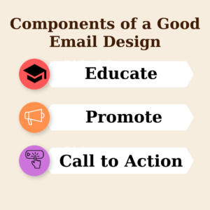
I recommend always including at least one educational component and one promotional component in your newsletter. The promotional component could be asking people to reach out for a consultation or buy something from you. It could also be something less salesy that is designed to encourage them to buy from you eventually, but not necessarily right away, such as signing up for your next webinar.
My Email Design Best Practices
If you aren’t a subscriber to my newsletter, here’s the format I use:
Header Image
My logo sits at the top of every email I send out. For a while, I tried switching up the header image to make it more specific to the Topic of the Week. But that got tedious and it didn’t improve my open rates or conversions, so I stopped doing it. It helps that MailChimp allows me to preset my logo as the header image of every newsletter I send out, so as long as I stick with that, that’s one less thing I have to do when putting my newsletter together.
Section 1: Blog Post
The first section of my newsletter is always an introduction to the blog post of the week with a link to the blog post for subscribers to read more if they’re interested.
Section 2: Speaking Gigs
If I’m going to be speaking at an upcoming event, or if I was recently on a podcast, I’ll promote that in the second section of my newsletter.
Section 3: Webinar Promotion
The third section is where I’ll promote my next webinar. If I recently hosted a webinar, I’ll use this section to lead people to the recording of the webinar if they missed it.
I usually conclude this section by telling people how they can reach me directly if they’re interested. Then I include my signature.
Section 4: Video
I always include a video at the end of each newsletter. It’s usually just a video of me talking about the Topic of the Week (i.e. whatever I talked about in my blog post that week,) but if I recently hosted a webinar, I might put the recording of the webinar here instead.
I’ve seen other people put their video at the top of their newsletter instead of at the bottom. I haven’t played with that strategy myself, but it’s definitely worth a shot. It might improve your open rates and/or conversions.
Different Email Designs for Different Purposes
The outline I gave above is the email design I use for my general newsletter that goes out every week to update my followers on what I’m doing these days. I have a different design I use for the emails in my drip campaign, and a third design for newsletters that are purely promotional or are making an announcement.
You don’t have to commit to one email design. You can use different designs for different purposes, and even then, feel free to change it up, which brings me to my next point.
Do Some A/B Testing
The point of using email design best practices is that you have one set email design so you don’t have to redesign every newsletter you send out. That said, you won’t know if you’re really using email design best practices until you test the design you’re using against other designs.
To determine if your email design is as effective as it can be, come up with two designs and send each of them to a representative sample of your subscribers. See which one gets the best results, and then you’ll know for sure that you’re using email design best practices.
Speaking of newsletters, you can sign up for ours by filling out your information in the space below. You can also see what we’re up to by following us on LinkedIn, YouTube, Instagram, and Facebook.
